A logo is a small picture. That’s the whole thing. It’s a small picture you’re hoping will do the work of about forty things.
People call us and say they need a logo. They say it the way you’d order a sandwich. One logo, please. And I understand the impulse — the logo is the part you can see. It goes on the hat. But a logo by itself is a doorknob with no door attached. Beautiful doorknob. Solid brass. Opens nothing.
What a logo actually is
A logo is one element of a visual identity. It is not the visual identity. The visual identity is the color palette, the typography, the photography, the layout, the spacing, the rules that govern all of it, and — this is the part nobody wants to pay for — the consistency that makes someone recognize you before they’ve read a single word.
The logo is the smallest piece of that. You’ve been negotiating hard over the smallest piece.
Why one symbol can’t carry a brand
Put a logo alone on a white page and watch it do nothing. It can’t tell anyone what you do. It can’t say what you care about. It’s a sticker. It only starts to mean something once the colors, the type, and the imagery around it all agree with each other and point in the same direction.
It’s like buying a single boot. A magnificent boot — Italian leather, hand-stitched, the works. And then walking around with the one boot, wondering why people keep looking. The boot was never the problem. The boot is great. You’re just missing everything else.
Consistency is the boring part, and the whole point
Here’s the unglamorous truth: the thing that builds a brand is repetition. Same colors every time. Same type every time. The same visual language on the website, the package, the email, the sign out front. People assume consistency is the boring option. Consistency is the reason you can identify a brand from across a parking lot with your glasses off.
How we actually build it
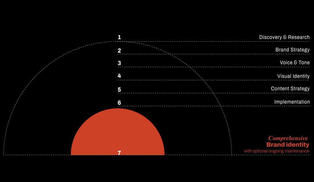
At Hellbeing we build the system, not the sticker. There are seven layers to it — discovery, brand strategy, voice and tone, visual identity, content strategy, implementation, and the full brand identity that comes out the other end. Each one holds up the one above it. Skip a layer and the whole thing leans. You can see the rest of the process here, and what it looks like finished over in our work.
You don’t need a logo. You have a logo. Everyone has a logo. What you need is the other ninety percent that makes the logo worth putting on the hat.
Quick answers
Is a logo the same as a visual identity?
No. A logo is a single mark. A visual identity is the full system — color, type, imagery, layout, and the rules that keep them consistent. The logo is one part of it.
Do I need a visual identity if I already have a logo?
Yes. The logo only works when there’s a system around it. On its own it’s a symbol with no context.
What’s included in a visual identity?
Color palette, typography, photography and illustration style, layout and spacing rules, and usage guidelines — applied the same way everywhere.